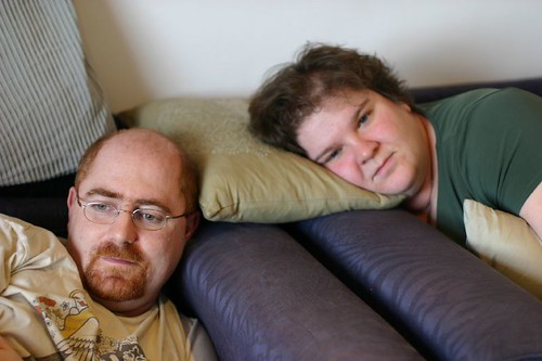
what a wonderful portrait. a really beautiful project by brenda, looking at her mother being active doing a variety of things.
This wonderful project is also a study of film versus digital. You may have noticed many of the photos on this blog are taken in a traditional manner, on film, For me, the colour rendition of shots such as these, a truthful representation of the cold window light, remains a compelling reason to continue with the expense of film. Next is the same shot taken digitally. The digital cameras often correct that colour rendition - it's called white balance - and they correct to an average of what the colour should be.
Personally, I like the blue one more, but actually it's nice to have the choice of both.

2 comments:
Thanks Sarah. :)
I like the blue one more too, although I could have printe it much warmer, the blue is closer to how I remember seeing it, the cold north light from the window on her table, in an otherwise cosy room.
It's a scan of a darkroom print, so it has a lot more going on in it, more luminosity, more depth, etc.
Don't get me wrong, I'm a convert to digital, I love my D80. But film is better if you want a picture to hold in your hand.
Just though you wouldn't mind if I drop a bit of news in here, Ms MM.
This photo has just won a Merit in the Fujifilm Student Photographer of the Year Award. They want a print to judge it in the final. Maybe if I'd sent the scanned digital version, instead of the scanned darkroom print.. who knows? :)
Post a Comment